
Getting Started
Just like in Microsoft Excel, the spreadsheets in Google Drive can also generate charts.
Keep reading to learn how...
Keep reading to learn how...
 1: Insert --> Chart
To generate a chart, start by selecting the data in your spreadsheet that you would like to use.
(Left-click, hold, and drag to select.)
(Left-click, hold, and drag to select.)
At the top of the page, click on Insert --> Chart
A menu will open where you can customize your chart.
2: Customize Your Data
On the first tab, you can customize the data used in your table.

Sometimes when Google initially generates a graph for you, it does not come out exactly how you wanted it. I annotated this image to show the difference between what Google generated and what I would like in my chart.
For instance, in my chart, I noticed that I had included an extra row of data from my spreadsheet. This made my data not be shown in my graph like I wanted it to. I changed the row that was used as a starting point for the data (Cell A1) to the next row (Cell A2) to fix that.
My chart is set to use Row 1 as headers, so once I fixed my data "students" was removed as one of my student names, and my "legend" of fruits appeared - apples, bananas, oranges.
I also want to add titles and labels to my chart and horizontal / vertical axes - we will do that later.
3: Customize Your Chart Type
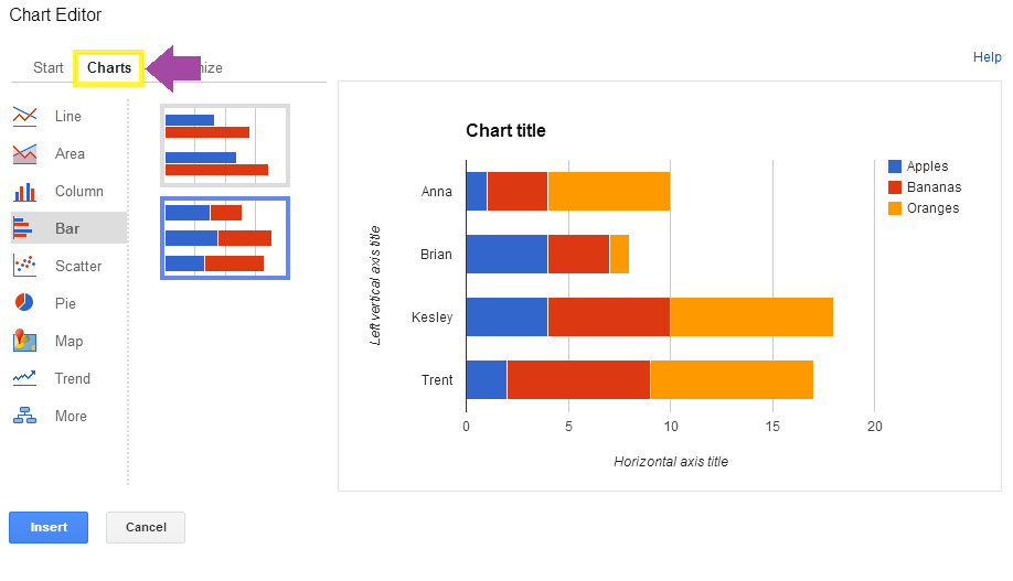
This type of bar graph helps to show the total amount of fruit each student ate, as well as how many of each fruit they ate.
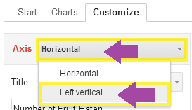
4: Enter Your Chart's Titles and Labels
Lastly, you can click on Customize to type in the title of your chart.

Scroll down to enter the horizontal label for your chart.


Click on the Insert button to finish your chart and add it to your spreadsheet.
6. Save or Print Your Chart

You can save your chart as an image by clicking the small arrow at the top-right corner of the chart.
Select Save Image
Once saved to your computer, you can print your chart or add it to a document, or even post it to a website...
